Brand Personality: The Sage
Your Trusted Guide in the Data Realm
In the vast landscape of data management, TimeXtender’s brand voice aims to weave wisdom with a spirit of confidence and fearlessness. Meet the Sage – your knowledgeable companion on the journey to unravel the mysteries of data. The Sage brand archetype is deeply rooted in the pursuit of truth and knowledge. Brands that embody this archetype are seen as wise, knowledgeable, and trusted sources of information.
What Is the Sage?
The Sage is
Human, Confident, Rational, Inspirational, Compassionate, Original
A Sage is an individual or entity characterized by a deep pursuit of knowledge, wisdom, and truth. In various contexts, a Sage often serves as a guide, mentor, or authority figure, providing valuable insights and guidance based on their profound understanding of a particular subject or field.
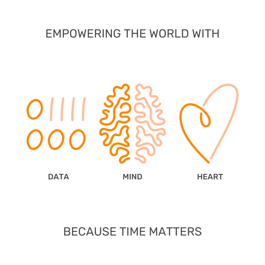
A Sage’s core characteristics revolve around intelligence, expertise, and the desire to help others understand the world more clearly (Data, Mind and Heart).
A Sage is caring and compassionate, and at times, unassuming. A Sage can be both serious and jovial, but never a pushover, a bully, or an obstacle. A Sage is fluid, adapting to new ideas and challenging old ones, moving everyone forward on the journey. A Sage is confident in their knowledge and abilities.
A Sage does not merely sit on the mountaintop, waiting for disciples. The Sage is among the people, teaching and learning, living life with those seeking wisdom.
Boilerplate
TimeXtender company descriptions
Full Boilerplate (100 words)
TimeXtender, through its automated data management platform, empowers the world with data, mind, and heart. We do this for one simple reason: because time matters. Every day we work to make the complex simple, to automate all that can be automated and to execute on what matters most. Our automated data management solution for building modern data estates enables getting to data-driven decisions faster – 10X faster than standard methods. A Microsoft Gold Certified Partner, TimeXtender serves its 3,300+ customers, from mid-sized companies to Fortune 500, through its global network of partners. TimeXtender was founded in 2006 and is privately owned. - placeholder, will be updated
<50 Word Boilerplate
TimeXtender, through its automated data management platform, empowers the world with data, mind, and heart. We do this for one simple reason: because time matters. A Microsoft Gold Certified Partner, TimeXtender serves its 3,300+ customers, from mid-sized companies to Fortune 500, through a global network of partners. - placeholder, will be updated
25 Word Boilerplate
TimeXtender, through its automated data management platform, empowers the world with data, mind, and heart. We do this for one simple reason: Because time matters.
<140 Character version
TimeXtender empowers the world with data, mind, and heart. Because time matters.
Tone of Voice
The Sage voice is Human, Confident, Rational, Inspirational, Compassionate and Original. Our brand voice aims to weave wisdom with a spirit of confidence and fearlessness. We communicate in a professional and trustworthy way, without sounding "corporate boring".
TimeXtender adheres to the rules and guidelines set forth in the AP Style Guide. Anyone who writes or edits material for TimeXtender - blogs, websites, newsletters, or other communication material - should refer to this guide. Use this style guide for questions regarding capitalization, punctuation, grammar, numbering, and general naming conventions.
Our tone of voice is all about bringing our brand personality to life; and it’s especially about being human at its core, just like our teammates, partners, and customers (are human).
WriteXtender
Your AI-Powered Writing Assistant
Remember, this is a writing assistant. Make sure to double-check the accuracy of outputs.
Our Visual Style
Scandinavian Minimalism
There is power in simplicity, so we strive to focus on what really matters. We use a grid to align text, photos, and elements in a layout. We use a hierarchy of information (Headlines, Subheads, body copy) to provide the audience with direct access to the information. We keep text to a minimum (less is more) and make sure it is powerful and to the point. Lastly, we use the scale of the images (large, medium, and small) to provide visual intrigue and emotional impact. Our utilitarian, clean and functional layouts aim to inform and inspire by being aesthetically pleasing and effective.
Core Logo
Our logo has several variations to ensure that it presents itself as consistently and unequivocally as possible, no matter the limitations and challenges that may arise during reproduction.


We prefer to have our logo displayed in its main colours presented above to ensure that it is most recognizable (but for those occasions where that's not possible, we've included a black and grayscale version in the Logo Kit above).
Isolated X
The shining star of our logo is the X. It embodies our brand personality. It is powerful and recognizable. We call ourselves the Xpeople because, much like this icon, we too strive to bring our individual uniqueness to the TimeXtender collective, making us stronger together.


This shortened version of our logo should be used in places where the full core logo would be too long.
Clear Space
Our logo is the embodiment of our brand summed up into one clear package.
Therefore, it must be perfectly legible and without obstruction, at all times.

Minimum Size
The logo should always be legible.

In print, the Core logo should never appear smaller than .125” tall (4.2mm), and on screen, it must appear at least 12px tall. The Isolated X logo in print should never appear smaller than .25” tall (6.4mm), and on screen it must appear at least 18px tall.
Don't Change The Logo
Use them as they are, don't add any effects or make your own versions.
No outlining
No distorting
No new fonts
No rotating
No off-brand colors
No repositioning of the elements
No shadows or other effects
Primary Colors
Colors define a mood and give a sense of character to our brand. We have selected three primary colors: orange - which grabs attention and signifies confidence - white - which denotes clarity and simplicity - and a dark grey - which allows contrast.
TX Orange
CMYK: 0, 64, 100, 0
RGB: 244, 123, 32
Hex: f47b20
Pantone: 716 C
White
CMYK: 0, 0, 0, 0
RGB: 255, 255, 255
Hex: ffffff
Dark Gray
CMYK: 0, 0, 0, 85
RGB: 77, 77, 79
Hex: 4d4d4f
Pantone: 425 C
Secondary Colors
The Shadow Gray should be used for font colors or in small doses so as not to take focus away from our primary brand colors. Ghost White and Lavender should be used for backgrounds, and Electric Sapphire is reserved for CTAs and links.
Shadow Gray
RGB: 24, 25, 39
Hex: 181927
Ghost White
RGB: 243, 243, 248
Hex: F3F3F8
Lavender
RGB: 226, 227, 239
Hex: E2E3EF
Electric Sapphire
RGB: 93, 104, 240
Hex: 5D68F0
Accessible Color Combinations
Make sure to have enough contrast between the font color and the background so it's easy to read the text. Our Grey and Dark Blue have a high contrast on White backgrounds; however, the Orange can be difficult to read on White, so use it sparingly and only in bigger font sizes.
Use the WebAIM tool if you need help with color contrast.
This has a high Contrast Ratio
This has a low Contrast Ratio
Geist
Geist stands out as a sans serif typeface, offering a spectrum of weights across both Roman and Italic variations. It radiates an aura of sophistication and professionalism, setting a premium standard. Its design ensures readability, with ample spacing between characters complemented by slender letterforms, making each word a breeze to navigate. This deliberate design choice infuses our brand with a blend of approachability and polished elegance.
ABCDEFGHIJKLMNOPQRSTUVWXYZÆØÅ
abcdefghijklmnopqrstuvwxyzæøå
0123456789?!@#%&(),.
You can get the font family from here.
Arial
Arial is our go-to font for Emails, Word documents, PowerPoint presentations, and various scenarios where using custom font families isn't an option.
ABCDEFGHIJKLMNOPQRSTUVWXYZÆØÅ
abcdefghijklmnopqrstuvwxyzæøå
0123456789?!@#%&(),.
Text Formatting Recommendations
Knowing how to format text helps to make written work look consistent and professional. Formatting can also add emphasis, style, or additional meaning to text.
To align with Sage's distinctive voice, we advocate for the adoption of lighter font weights and Title Cases in all headlines. This approach involves capitalizing the first letter of each word, imbuing our headers and titles with an air of confidence and professionalism.
Employ bold typeface and CAPITAL LETTERS sparingly, allocating them primarily for calls to action and key points of emphasis.
Imagery & Iconography
Visuals support our messaging and create interest. It is very important that they are clear, easy to understand and make our brand recognisable. The photos, illustrations and icons we use should align with our voice.
/BrandGuide/Photo%20ref1.png)
/BrandGuide/Photo%20ref2.png)


Social Media
Our social media presence exists to share clear, practical insights about data, highlight the value of the TimeXtender Data Platform, and support our community of customers, partners, and Xpeople. We focus primarily on LinkedIn to show how organizations can build AI-ready data for every decision through a metadata-driven, automated, and unified data lifecycle.
The TimeXtender Sound
On social media, we speak with the same Sage-inspired voice as in all other channels: human, confident, rational, and original. We provide the foundation for important business decisions, so our tone is responsible and precise, never theatrical or sensational.
If a post feels too promotional, refocus on the outcome: describe how we reduce time‑to‑insight or risk, rather than asking people to “buy the platform.”
We aim to sound:
-
Authoritative, because we own the metadata-driven, automated data platform space, but never arrogant.
-
Accessible, translating complex ELT and AI infrastructure topics into concrete business outcomes, without being jargon-heavy.
-
High‑performance, focused on speed to delivery, unit economics, and measurable impact, not abstract or vague claims.
-
Insightful, offering decision‑grade perspectives instead of clickbait hooks.
-
Visionary, showing where AI-ready data and unified data lifecycles are heading, without reacting to every trend.
Core Messaging for Social Posts
Consistency on social media reinforces our positioning and helps audiences quickly understand what we stand for.
When relevant, anchor posts around:
-
Core pillars: Automated Data Platform, Metadata‑Driven, Unified Data Lifecycle.
-
Strategic hooks: Deterministic Automation, No Vendor Lock‑In, Tenant Sovereignty.
Use these terms naturally inside real sentences, not as a list of buzzwords. For example, instead of naming features in isolation, explain how a metadata‑driven, automated data lifecycle shortens delivery time, improves governance, or avoids vendor lock‑in.
Do
-
Share behind‑the‑scenes wins, such as technical breakthroughs, “aha” moments, and real stories from the Xpeople.
-
Cite credible research and benchmarks from recognized analyst firms or our own validated results when you reference performance or impact.
-
Engage meaningfully in comments with short, clear insights or clarifying questions, rather than one‑word replies.
-
Highlight how our four modules (Data Integration, Data Enrichment, Data Quality, and Orchestration) work together across the unified data lifecycle.
Don’t
-
Use clickbait language such as “You won’t believe…” or over‑dramatic promises.
-
Engage in political, personal, or unrelated controversy; stay focused on data, technology, and business value.
-
Share unverified statistics or any information you are not confident is accurate and current.
-
Post anything that exposes client data, internal systems, or unreleased product information.
Partners and “Better Together”
We treat hyperscalers and core data platforms such as Microsoft Fabric and Snowflake as strategic partners, not rivals. Our social media content should reflect a “better together” story: TimeXtender accelerates adoption, improves orchestration, and optimizes cost and quality on top of these platforms.
When sharing partner news or joint stories:
Hashtags and Tagging
Use hashtags to clarify context and reach relevant audiences, not as decoration.
A simple pattern for LinkedIn posts:
-
1 brand hashtag, for example #TimeXtender.
-
2 industry hashtags, such as #SemanticLayer, #Metadata, #DataAutomation, #AIReady, #DataEngineering, or similar.
-
1 niche or topical hashtag that fits the specific post, such as #MicrosoftFabric, #FinOps, or #DataGovernance.
Tag partners or external stakeholders when the content is directly relevant to them, and when the tag adds clear value for the audience. Avoid tagging accounts purely to gain attention.
Visual Guidelines for Social Posts
Social visuals should match our Scandinavian, minimal, and structured design language described above. They must be readable, accurate, and understandable in a few seconds, even without the caption.
For all social visuals:
-
Communicate one clear idea per image or frame, using whitespace and alignment to guide the eye.
-
Assume the visual might be reshared without context, so it must stand on its own.
-
Design for mobile first; all text should be legible on a small screen without zooming.
-
Keep layouts calm and structured, avoiding clutter, exaggerated arrows, or overly promotional effects.
For formats:
-
Use a single image when you have one focused message and a simple story.
-
Use a carousel when explaining a short sequence, such as “Customer problem → Approach → Result,” ensuring each slide adds new information and follows a consistent layout. End carousels with a clear takeaway or next step (for example, a key lesson, metric, or link to a deeper resource).

Co-branding
Our partnership program offers different co-branding opportunities and co-branding helps us create success together by jointly increasing our brand awareness, market reach and customer base.
-
Joint Campaigns and Events
Our collaborative program opens the door to innovative campaigns and events, designed to mutually enhance our brand visibility, expand our market presence, and grow our collective customer bases.
-
Partner Portal
Head to our Partner Portal to access an exclusive collection tailored for Partners, featuring marketing resources, campaign kits, and more.
-
Reach Out
If you have questions about the TimeXtender brand or wish to explore co-branding possibilities, please don't hesitate to contact us.
